
Page 25 - ArchDC_Summer2021
P. 25
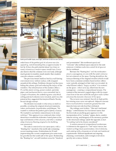
Seating and model display area (right), and main conference room (center).
                       orderliness of the perfect grid of columns was also   and presentation” (the northwest space) and
                       appealing, notwithstanding that, at approximately 14   “welcome” (the northeast space adjacent to the suite
                       feet by 16 feet, the grid entailed about four times as   entrance). A kitchen tucks into a small bit of space at
                       many columns as a modern space would have. It was   the far northeast.
                       also known that the columns were steel and, although      Between the “floating box” and the workstation
                       much greater in number, much smaller than modern   area is a passageway, on axis with the suite’s entrance
                       concrete columns would be.                      but not centered on the space. During demolition, the
                          The previous tenant buildout had drywall furring   terrazzo flooring of the original corridor (which would
                       over almost every vertical surface, with dropped   have been a common corridor, based on how offices
                       acoustical tile ceilings. Partitions chopped up the space,   were typically arranged at that time) was revealed. In
                       hiding the column grid and reducing the impact of the   what Klinner called a “happy accident,” it is centered
                       windows. The infrastructure of the modern office—  on the space—which is to say, offset from the new
                       IT and fire alarm wiring, power conduit, sprinkler   passageway—creating a compositional tension. The
                       pipes, and mechanical ducts—was concealed, but in   contrast of the terrazzo’s ragged edges with the super-
                       a couple of locations, the underlying terra cotta block   clean lines of the new millwork and glass walls further
                       ceiling and steel columns were revealed, and it was the   enhances the dynamic character of the space.
                       potential they suggested that inspired Studio Twenty      The terrazzo was restored, literally to high polish,
                       Seven’s design concept.                         but missing areas were not replaced. Adjacent concrete
                          The decision was made to strip away as much as   floors received similar treatment: ground flat with
                       possible, revealing the original structural materials,   imperfections not only kept but celebrated.
                       colors, and textures. In particular, said Klinner, “We      The ceilings were trickier. “This isn’t traditional
                       wanted to celebrate the perfect grid of [steel] columns.   design,” noted Klinner, but that doesn’t mean that
                       We wanted to use historic remembrance to do more   the firm took an anything-goes approach to the
                       with less.” This approach was catalyzed when initial   incorporation of the “systems” (pipes, ducts, conduit,
                       demolition revealed the elaborate riveted plates at the   telecom wiring, and hangers) or the necessary patches
                       tops and bottoms of the columns, and when a residual   in the structural ceilings. Quite the opposite, in fact:
                       strip of terrazzo flooring original to the building    “Everything had to be closely considered.”
                       was uncovered.                                      A certain amount of compositional randomness
                          The suite is conceived as one open space, with a   is inherent to the appeal of a “loft”-style interior, but
                       “floating box” inserted at the north side containing   modern ceilings must accommodate a lot of elements,
                       several meeting rooms. Workstations for 18 staff   each coming with a disparate set of code and functional
                       (representing the current complement plus some room   requirements. Without significant and ongoing
                       for growth) line the south side of the space. Bookending   planning, coordination, and oversight, it devolves
                       the “floating box” are soft furniture areas for “breakout   quickly into a messy thicket.


                                                                                 LOFTY AMBITIONS                  23