Page 79 - Spring_2018
P. 79

ArchDC Spring 2018.qxp_Fall 2017  2/22/18  9:16 AM  Page 77


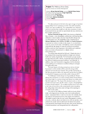
                  Interior of the Walkway, as installed at 14th and U streets, NW.
                                                                 Project: The Walkway (Vision Zero),
                                                                 temporary structure now removed, Washington, DC
                                                                 Architects: Michael Marshall Design, previously Marshall Moya Design
                                                                 LED Lighting Designers/Programmers: Image Engineering
                                                                 Electrical Contractor: Direct Electric
                                                                 Programming Consultant: Rosie Storey
                                                                 Waste Haulers: Selective Hauling LLC
                                                                 Contractor: Gilbane


                                                                        This idea coalesced in the form of an open design competition
                                                                sponsored by the DC Commission on the Arts and Humanities,
                                                                DDOT, and Age-Friendly DC. The competition brief solicited
                                                                public art concepts that would not only raise awareness of street
                                                                harassment but also provide the opportunity for data collection on
                                                                how people experience it.
                                                                        Michael Marshall Design (MMD, then known as Marshall
                                                                Moya Design), a cross-disciplinary architecture and branding firm,
                                                                submitted a mixed-media, physical/digital hybrid design that
                                                                won the judges over. The competition entry, spearheaded by
                                                                Michael Marshall, AIA, NOMA, NCARB, and Zarela Mosquera,
                                                                envisioned an outdoor pavilion in the shape of a covered linear
                                                                walkway, open on both ends, with lighting, sound, and graphics
                                                                integrated into the design to create an immersive experience.
                                                                Visitors could text their responses to the exhibit, and contribute
                                                                their own stories of harassment to a digital archive
                                                                (www.wlkway.com).
                                                                        The design team selected the 14th and U Street site (one of
                                                                two options in the competition brief) for its high level of street
                                                                traffic and variety of passersby. “In this location you get people
                                                                moving back and forth to Metro, commercial and residential, and
                                                                the [Reeves Center] government building,” said Marshall. In
                                                                addition, they were interested in engaging with the after-dark
                                                                crowd spilling out of restaurants and bars well past midnight
                                                                throughout the week.
                                                                        The team began collecting anonymous stories of street
                                                                harassment on the website in 2016, while the design of the
                                                                physical environment was finalized. The pavilion, fabricated on
                                                                site through generous labor and material donations by the Gilbane
                                                                Construction Company, opened to the public in January 2017.
                                                                        The Walkway’s bowtie shape was inspired by the Venturi
                                                                effect in fluid dynamics. (A simple example of the Venturi effect: a
                                                                river flows faster in a narrow canyon and slower in a wide plain.)
                                                                Marshall explained, “The shape of the structure starts as a wide
                                                                aperture that tapers back into the center—to give a claustrophobic
                                                                feeling of being watched.” The corridor narrows from 11 feet wide
                                                                at the entry to seven feet at the central pinch point; in tandem,
                                                                the ceiling slopes down from nine feet high at the openings to
                                                                seven feet at the center.
                                                                        The walls of The Walkway, framed with two layers of steel
                                                                studs with diagonal cross-bracing, were clad in polycarbonate
                                                                panels. Transparent below waist level (to allow for visibility from
                                                                the outside) and translucent above, the panels were backlit by
                                                                LED lights located within the wall cavity. Photographic portraits
                                                                of people, vertically sliced and interwoven with one another, were
                                                                printed onto acrylic and mounted onto the interior face panels.
                                                                Complementing these larger-than-life faces, first-person narratives
                                                                of street harassment were integrated into the wall graphics.


                                      Photo © John Keith Photography       MAKING ROOM FOR ART                 77
   74   75   76   77   78   79   80   81   82   83   84