Page 61 - ArchDC Fall 2018
P. 61
seen   ArchDC Fall 2018.qxp_Fall 2018  8/27/18  8:35 AM  Page 59

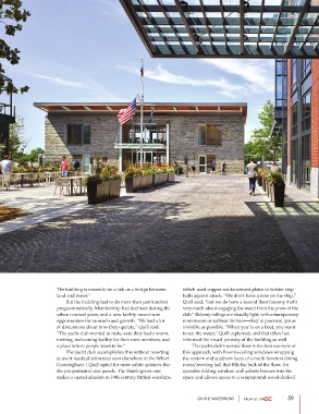
                       The building is meant to be a link or a bridge between  which used copper reinforcement plates to bolster ship
                       land and water.”                                hulls against attack. “We don’t have a bow on the ship,”
                               But the building had to do more than just function  Quill said, “but we do have a second floor balcony that’s
                       programmatically. Membership had declined during the  very much about engaging the water from the prow of the
                       urban renewal years, and a new facility meant new  club.” Balcony railings are visually light, with a transparency
                       opportunities for outreach and growth. “We had a lot   reminiscent of sailboat lifelines—they’re practical, yet as
                       of discussions about how they operate,” Quill said.   invisible as possible. “When you’re on a boat, you want
                       “The yacht club wanted to make sure they had a warm,  to see the water,” Quill explained, and that ethos has
                       inviting, welcoming facility for their own members, and   informed the visual porosity of the building as well.
                       a place where people want to be.”                       The yacht club’s second floor is the best example of
                               The yacht club accomplishes this without resorting  this approach, with floor-to-ceiling windows wrapping
                       to overt nautical references seen elsewhere in the Wharf.  the eastern and southern faces of a multi-function dining
                       Cunningham | Quill opted for more subtle gestures like  room/meeting hall that fills the bulk of the floor. An
                       the pre-patinated zinc panels. The bluish-green zinc  operable folding window wall admits breezes into the
                       makes a casual allusion to 19th-century British warships,  space and allows access to a wraparound wood-decked


                                                                             ON THE WATERFRONT                 59

