Page 49 - ArchDC_Winter2017
P. 49
ArchDC Winter 2017.qxp_Fall 2017  11/17/17  5:49 PM  Page 47


        Citation for Detail

        Aesop The Shay
        Washington, DC
        David Jameson Architect
        General Contractor: Madden, CCI


        The Australian cosmetics firm Aesop is perhaps an ideal
        client. The company’s stated goal is that the designs of its
        stores match its products in terms of “meticulous atten-
        tion to detail, and with efficacy and sensory pleasure in
        mind.” Aesop commissions modern spaces that, while
        tending to avoid obvious regional references, are never-
        theless tied to their locations, incorporating concepts,
        details, and materials drawn from local circumstances.
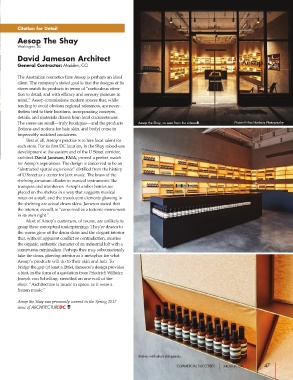
        The stores are small—truly boutiques—and the products  Aesop the Shay, as seen from the sidewalk.  Photos © Paul Barbera Photography
        (lotions and notions for hair, skin, and body) come in
        impeccably matched containers.
                Best of all, Aesop’s practice is to hire local talent for
        each store. For its first DC location, in the Shay mixed-use
        development at the eastern end of the U Street corridor,
        architect David Jameson, FAIA, proved a perfect match
        for Aesop’s aspirations. The design is conceived to be an
        “abstracted spatial experience” distilled from the history
        of U Street as a center for jazz music. The brass of the
        shelving armature alludes to musical instruments like
        trumpets and trombones. Aesop’s amber bottles are
        placed on the shelves in a way that suggests musical
        notes on a staff, and the translucent elements glowing in
        the shelving are actual drum skins. Jameson stated that
        the interior, overall, is “conceived as a tectonic instrument
        in its own right.”
                Most of Aesop’s customers, of course, are unlikely to
        grasp these conceptual underpinnings. They’re drawn to
        the warm glow of the drum skins and the elegant interior
        that, without apparent conflict or contradiction, marries
        the organic, authentic character of an industrial loft with a
        sumptuous minimalism. Perhaps they may subconsciously  Shop interior.
        take the clean, glowing interior as a metaphor for what
        Aesop’s products will do to their skin and hair. To
        bridge the gap (at least a little), Jameson’s design provides
        a hint, in the form of a quotation from Friedrich Wilhelm
        Joseph von Schelling, stenciled on one wall of the
        shop: “Architecture is music in space, as it were a
        frozen music.”

        Aesop the Shay was previously covered in the Spring 2017
        issue of ARCHITECTUREDC.


                                                           Shelves with drum skin panels.

                                                                           COMMERCIAL SUCCESSES                47

