Page 46 - ArchDC_Winter2017
P. 46
ArchDC Winter 2017.qxp_Fall 2017  11/17/17  5:49 PM  Page 44


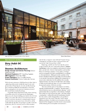
        Side view of the new courtyard pavilion at Dirty Habit DC.                      Photo © Mark Wickens

        Merit Award in Architecture                      entered into a long-term lease with the Kimpton Group,
                                                         a hospitality chain that oversaw a full renovation and
        Dirty Habit DC                                   opened the Hotel Monaco there in 2002.
        Washington, DC                                           Replacing a smaller pavilion that had also earned
                                                         design accolades, the new courtyard pavilion by Stanton
        Stanton Architecture                             Architecture evokes the meticulous modernism of Ludwig
                                                         Mies van der Rohe. Slender, black mullions and muntins
        Design Concept and Interior Planning: Dawson
                                                         blend in with large expanses of dark glass, forming a
        Design Associates
                                                         perfectly rectangular box that is unadulterated by overhangs
        Structural Engineers: KPFF Consulting Engineers
                                                         or other protrusions. Although it abuts a portion of the
        MEP Engineers: Wick Fisher White
                                                         historic building housing the main dining room, the pavilion
        Project Managers: Ajax Consulting Services
                                                         is structurally independent, fulfilling the requirements of
        General Contractor: Potomac Construction Services
                                                         preservation authorities that the addition be reversible.
                                                         Adjacent terraces and steps are of light stone with railings
        While the new entrance at 1500 Broadway in New York is
                                                         of light-colored metal and glass, so as not to detract from
        a gleaming white accent amidst the orgy of color and
                                                         the geometric purity of the new pavilion.
        pattern that is Times Square, the new pavilion housing
                                                                 The most notable aspect of the project is its techno-
        part of the Dirty Habit bar and restaurant is the dark,
                                                         logically sophisticated skin. It employs “dynamic glass”—
        sleek counterpoint to the reserved classicism of one of
                                                         more technically known as electrochromic glazing—which
        DC’s most historic federal buildings.
                                                         automatically tints in proportion to the intensity of sunlight.
                Originally designed by Robert Mills, whose winning
                                                         This system not only reduces heat gain—and thus energy
        competition entry was the basis for the Washington
                                                         consumption—without the need for mechanized shades,
        Monument, the historic building was built for the U.S. Post
                                                         but also yields a subtle changeability in the pavilion’s
        Office in the early 19th century and later housed the U.S.
                                                         appearance over the course of the day. Under certain
        Tariff Commission. Its massive, unforgivingly compart-
                                                         lighting conditions, the effect can be uncanny, as the new
        mentalized structural system had rendered it a white
                                                         structure all but disappears from the viewer’s consciousness
        elephant by the late 20th century. Eager to put the landmark
                                                         while reflecting the stone façades that surround it.
        to good use, the U.S. General Services Administration
           44                     COMMERCIAL SUCCESSES

