Page 55 - Summer_2019
P. 55
ArchDC Summer 2019.qxp_Spring 2019  5/22/19  3:01 PM  Page 53


                                                                 Project: St. Augustine’s Episcopal Church,
                                                                 555 Water Street, SW, Washington, DC
                                                                 Architects: MTFA Architecture
                                                                 Structural Engineers: Ehlert Bryan Consulting Structural Engineers
                                                                 MEP Engineers: Metropolitan Engineering, Inc./Shapiro-O’Brien;
                                                                 Potomac Energy Group
                                                                 Civil Engineers: AMT, LLC
                                                                 Commercial Food Service Designers: Drafting & Design, LLC
                                                                 Owner’s Representative: KCM, Inc.
                                                                 Contractor: Scott-Long Construction, Inc.


                                                                        Employing a strategy currently being used by multiple
                                                                Washington-area churches, St. Augustine’s sold part of its site for
                                                                commercial development and used the proceeds to help finance
                                                                the new structure. The part that was sold faces the water and was
                                                                used for a new 107-unit condominium development designed by
                                                                Bethesda-based SK&I Architecture. The smaller slice that the
                                                                church retained for its own use runs along Maine Avenue and
                                                                faces inland, toward the community served by the church. The
                                                                retained parcel’s limited area meant that the new church building
                                                                had to be a two-story structure.
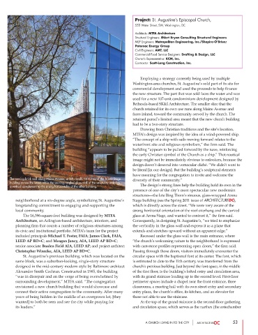
                                                                        Drawing from Christian traditions and the site’s location,
                                                                MTFA’s design was inspired by the idea of a wind-powered ship.
                                                                “The concept of a ship with sails moving forward relates to the
                                                                waterfront site and religious symbolism,” the firm said. The
                                                                building “appears to be pulled forward by the nave, reinforcing
                                                                the early Christian symbol of the Church as a ship.” That nautical
                                                                image might not be immediately obvious to onlookers, because the
                                                                design doesn’t descend into vernacular cliché. “We didn’t want to
                                                                be literal [in our design]. But the building’s sculptural elements
                                                                have meaning for the congregation to invite and welcome the
          The curving brick wall along Maine Avenue, at left, recalls the curves of the Arena Stage  diversity of their community.”
      building across the street, while the soaring, angled glass wall of the sanctuary provides
                                                                        The design’s strong lines help the building hold its own in the
      a vertical complement to the strong horizontality of the other building.
                                                                presence of one of the city’s most spectacular new modernist
                                                                structures—the late Bing Thom’s sinuous, glass-wrapped Arena
         neighborhood at a six-degree angle, symbolizing St. Augustine’s  Stage building (see the Spring 2011 issue of ARCHITECTUREDC),
                                                                which is directly across the street. “We were very aware of the
        longstanding commitment to engaging and supporting the
                                                                strong horizontal orientation of the roof overhang and the curved
        local community.
                 The 16,396-square-foot building was designed by MTFA
        Architecture, an Arlington-based architecture, interiors, and  glass at Arena Stage, and wanted to contrast it,” the firm said.
                                                                Consequently, in designing St. Augustine’s, “we tried to emphasize
        planning firm that counts a number of religious structures among  the verticality in the glass wall and express it as a plane that
        its civic and institutional portfolio. MTFA’s team for the project  extends and stretches upward without an apparent edge.”
        included principals Michael T. Foster, FAIA; James Clark, FAIA,          Recessed under the glass wall is the main entrance, where
        LEED AP BD+C; and Meagan Jancy, AIA, LEED AP BD+C;      “the church’s welcoming nature to the neighborhood is expressed
        senior associate Braden Field AIA, LEED AP; and project architect  with cast-stone profiles representing open doors,” the firm said.
        Christopher Winnike, AIA, LEED AP BD+C.                 Passing through those doors, visitors immediately encounter the
                St. Augustine’s previous building, which was located on the  circular space with the baptismal font at its center. The font, which
        same block, was a suburban-looking, single-story structure  is estimated to date to the 11th century, was transferred from the
        designed in the mid-century modern style by Baltimore architect  church’s previous building. Just beyond the font space, in the middle
        Alexander Smith Cochran. Constructed in 1965, the building  of the first floor, is the building’s lofted entry and circulation area,
        “was in disrepair and on the verge of being overwhelmed by  with its grand staircase leading up to the second level. First-floor
        surrounding development,” MTFA said. “The congregation   perimeter spaces include a chapel near the front entrance, three
        envisioned a new church building that would showcase and  classrooms, a meeting hall with its own street entry and secondary
        connect their active congregation to the community. After many  entry plaza, the church’s office, its kitchen, and an elevator for
        years of being hidden in the middle of an overgrown lot, [they  those not able to use the staircase.
        wanted] to both be seen and see the city while praying for           At the top of the grand staircase is the second-floor gathering
        its leaders.”                                           and circulation space, which serves as the narthex (the antechamber


                                                                      A CHURCH LEANS IN TO THE CITY            53

