Page 42 - ArchDC Spring_2017
P. 42
ArchDC Spring 2017.qxp_Spring 2017  2/22/17  2:48 PM  Page 40


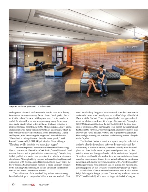
        Lounge and pre-function space in the UDC Student Center.


        underground electrical vault that could not be built over. Taking  stone panels along the grand staircase recall both the concrete that
        into account these two factors, the architects developed a plan in  defines the campus and nearby commercial buildings of buff brick.
        which the bulk of the new building was placed at the southern  The rest of the Student Center is primarily clad in copper-colored
        end of the site, with a narrow wing running along the western  metal panels that complement the beige of the concrete. Aiming for
        edge and a smaller plaza to the northeast that now serves as a  LEED Platinum certification, the architects limited the total glass
        more appropriate complement to the Metro entrance. A new grand  area of the façades, thus minimizing solar gain in the summer and
        staircase links the plaza with an upper-level quadrangle, which in  heat loss in the winter. A syncopated pattern of slender windows adds
        turn connects to sidewalks that lead to the International Center  interest and visual rhythm. Vertical fins of perforated aluminum
        and beyond, thus preserving the neighbors’ beloved shortcut.   filter sunlight entering the windows while lending a sense of depth
        “The school is calling this new plaza the ‘front porch,’” said  to the façades.
        Roland Lemke, AIA, LEED AP, principal at CannonDesign.           The Student Center’s interior programming also reflects the
        “The stairs are like the stairs to a house, just bigger.”  desire to blur the boundaries between the university and the
                 “The site is right next to one of five commercial hubs along  community. A spacious atrium, accessible directly from the small
        Connecticut Avenue [above Rock Creek Park],” noted Marshall, “and  plaza and lined in the same copper-colored panels used on the
        we saw this as a real opportunity for place-making.” Contributing  exterior, serves as a dining and social hub for students and the public.
        to that goal is the project’s most prominent architectural element, a  Street-level retail and independent food service establishments are
        clock tower. Although utterly modern in its architectural form and  expected to open soon. Upper levels include offices for the student
        expression, with its slim, angled fins bracketing a glassy spire, the  newspaper and student government, along with a “wellness center”
        tower fulfills a traditional role, helping to mark the main entrance  that neighborhood residents may use for a small fee. Meeting and
        to the building while creating an instant landmark visible from  gathering spaces are also available to community groups by request.
        well up and down Connecticut Avenue.                            Marshall can claim a personal connection to UDC that proved
                 The architecture of the new building relates to the existing  helpful during the design process. “I started my academic career at
        Brutalist buildings on campus but offers a warmer aesthetic. Cast  UDC,” said Marshall, who went on to get his bachelor’s degree


           40                     RECENTERED

