Page 41 - ArchDC Spring_2017
P. 41
ArchDC Spring 2017.qxp_Spring 2017  2/22/17  2:48 PM  Page 39


         Recentered
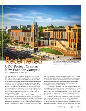
        Recentered                                                           UDC Student Center, as seen from across Connecticut Avenue.


                                                                             The exterior staircase at right leads to a quadrangle that connects
                                                                             to public sidewalks and neighborhoods beyond.
        UDC Project Creates

        New Face for Campus

        by G. Martin Moeller, Jr., Assoc. AIA


        The main campus of the University of the District of Columbia  and Van Ness Street, adjacent to a Metro station entrance. From a
        (UDC) in the Van Ness neighborhood of Northwest Washington  purely institutional standpoint, the idea of placing a student center
        was initially developed between the 1960s and very early 1980s,   at one extreme corner of the campus might seem surprising, but
        an era in which institutional architecture tended to be monumental,  the design team recognized that this site offered an unmatched
        often at the expense of cohesive streetscapes and inviting open  opportunity both to enhance the university’s identity and to
        spaces. Consisting mostly of blocky, concrete-clad buildings with  strengthen its ties to its urban context.
        relatively few windows, the university has long lacked a distinct          “It was a whole new paradigm,” said Michael Marshall, AIA,
        architectural identity. Furthermore, the substantial setbacks of the  NOMA, design director and principal of Marshall Moya. “University
        buildings closest to Connecticut Avenue, the busy thoroughfare  centers have traditionally been at the centers of their campuses,
        lining one edge of the campus, isolated the institution from the  because they were solely student-focused. [Instead,] we created a
        surrounding community.                                  new gateway—a new face for the campus—breaking down the
                 The architects of the new Student Center at UDC recognized  town/gown divide.”
        immediately that the project was fundamentally an urban design          The site was previously an aesthetically barren plaza, though
        problem. The team of CannonDesign and Marshall Moya Design,  one that provided a popular shortcut for pedestrians walking
        who won the commission through a design competition, explored  between the Metro and either the International Center, an enclave
        three different possible sites for the new facility before settling on a  of foreign embassies adjacent to the campus, or residential areas to
        roughly triangular sliver of land at the corner of Connecticut Avenue  the west. Beneath the northeastern portion of the plaza was a large

                                                                                   RECENTERED                  39

