Page 38 - Fall 2019
P. 38
Chapter Design Award in Architecture

        Bancroft Elementary School
        Washington, DC
        Ayers Saint Gross / Jonathan
        Kuhn Architect

        Landscape Architects: Lee and Associates
        Structural Engineers: SK&A Structural Engineers
        MEP Engineers: JVP Engineers PC
        Civil Engineers: Wiles Mensch Corporation—DC
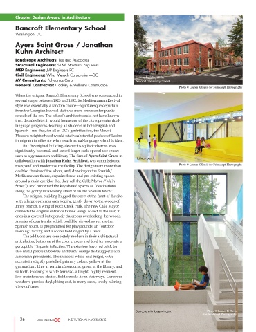
                                                                  Existing building at the
        AV Consultants: Polysonics Corp.                          Bancroft Elementary School.
        General Contractor: Coakley & Williams Construction
                                                                                       Photo © Lauren K Davis for Feinknopf Photography
        When the original Bancroft Elementary School was constructed in
        several stages between 1923 and 1932, its Mediterranean Revival
        style was essentially a random choice—a picturesque departure
        from the Georgian Revival that was more common for public
        schools of the era. The school’s architects could not have known
        that, decades later, it would house one of the city’s premier dual-
        language programs, teaching all students in both English and
        Spanish—nor that, for all of DC’s gentrification, the Mount
        Pleasant neighborhood would retain substantial pockets of Latino
        immigrant families for whom such a dual-language school is ideal.
                But the original building, despite its stylistic charms, was
        significantly too small and lacked larger-scale special-use spaces
        such as a gymnasium and library. The firm of Ayers Saint Gross, in
                                                                    Hallway bench.
        collaboration with Jonathan Kuhn Architect, was commissioned
        to expand and modernize the facility. The design team more than                Photo © Lauren K Davis for Feinknopf Photography
        doubled the size of the school, and, drawing on the Spanish/
        Mediterranean  theme,organized new and pre-existing spaces
        around a main corridor that they call the Calle Mayor (“Main
        Street”), and conceived the key shared spaces as “destinations
        along the gently meandering street of an old Spanish town.”
                 The original building hugged the street at the front of the site,
        with a large open rear area sloping gently down to the woods of
        Piney Branch, a wing of Rock Creek Park. The new Calle Mayor
        connects the original entrance to new wings added to the rear; it
        ends in a covered but open-air classroom overlooking the woods.
        A series of courtyards, which could be viewed as yet another
        Spanish touch, is programmed for playgrounds, an “outdoor
        learning” facility, and a soccer field ringed by a track.
                 The additions are completely modern in their architectural
        articulation, but some of the color choices and bold forms create a
        perceptible Hispanic inflection. The exteriors have red brick but
        also metal panels in browns and burnt orange that suggest Latin
        American precedents. The inside is white and bright, with
        accents in slightly pastelled primary colors: yellow at the
        gymnasium, blue at certain classrooms, green at the library, and
        so forth. Flooring is white terrazzo, a bright, highly resilient,
        low-maintenance choice. Bold murals liven stairways. Generous
        windows provide daylighting and, in many cases, lovely calming
        views of trees.


                                                                  Staircase with large window.      Photo © Lauren K Davis
                                                                                                  for Feinknopf Photography
           36                     INSTITUTIONAL INVESTMENTS

