Page 36 - Fall 2019
P. 36
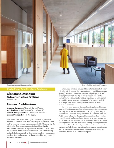
The Glenstone Museum Administrative Offices.                                     Photo © Ron Blunt Architectural Photography
        Chapter Design Award in Interior Architecture                    Glenstone’s mission is to support the contemplation of art, which
                                                                it does by strictly limiting the quantity of visitors, sprinkling artworks
        Glenstone Museum                                        sparingly around luminous but very neutral gallery spaces, and
        Administrative Offices                                  isolating visitors from the day-to-day of modern life. For the
                                                                administrative offices, Stantec worked to provide an environment
        Potomac, MD                                             as ennobled as the museum galleries—if a bit more crowded
                                                                with people, and with a stronger connection to the world
        Stantec Architecture                                    outside of Glenstone.
                                                                        An open office area lines the floor-to-ceiling glass wall facing a
        Museum Architects: Thomas Phifer and Partners           courtyard (itself a minimalist field of beige stones). The workstations,
        MEP Engineers: ASW / Altieri Sebor Wieber LLC           naturally, follow the precise module of the glazing, with fairly tall
        Project Managers: Mark G. Anderson Consultants          wood-veneer knee walls hiding the clutter of computers, files, and
        General Contractor: HITT Contracting
                                                                Post-it Notes. Inboard of the open office is another glass wall, this
                                                                time with wood mullions and door frames, which separates private
        The newest complex of buildings at Glenstone, a private art
                                                                offices, a library, and a lounge for the museum’s docents. Recessed
        museum in Potomac, Maryland, was designed by Thomas Phifer
                                                                downlights were cast into the concrete ceilings, making them even
        and Partners and opened to great acclaim in 2018. In designing the
                                                                more minimal than they typically are. All elements are very simple,
        interiors for the museum’s administrative offices, Stantec
                                                                demanding of a high level of craftmanship and design coordination,
        Architecture conceived the space as a seamless continuation of
                                                                and this strategy appears to be very successful at allowing the
        the museum’s “rational aesthetic approach.” The firm used only
                                                                occasional artwork to be a central focal point.
        materials that were already in the museum’s palette—wood, glass,
        stainless steel, and concrete—and maintained the very spare,
        minimalist aesthetic.
           34                     INSTITUTIONAL INVESTMENTS

