Page 18 - Fall 2019
P. 18
renewed sense of vitality to an otherwise stuffy part of
        town. According to Pasquarelli, the developer, Carr
        Properties, supported this generous approach, perhaps
        because in this case it did not require sacrificing any
        buildable square footage, and also because this was
        the first commercial building in the city to be permitted
        under new zoning laws allowing fully occupiable
        penthouses above the main height limit—a boon in terms
        of leasable space.
                The central courtyard, designed by landscape
        architects SCAPE Studio, consists of an irregular pattern
        of crisp geometric shapes—some paved, some planted,
        some with seating, and one open to a slightly recessed,
        cascading fountain. Complementing the diagonal
        pedestrian paths at ground level are the three sky bridges,
        which are lined with copper fins that help shade the
        glass-enclosed corridors, but also cast ever-changing
        shadows that animate the plaza and its perimeter. The
        juxtaposition of the rectangular grid of the office building
        and the intersecting diagonals of the ground-level paths
        and sky bridges recalls the similar geometries of Pierre
        Charles L’Enfant’s original plan for the city of
        Washington. The effect is equally dynamic.
                 In contrast to the smooth glass curtain wall façades
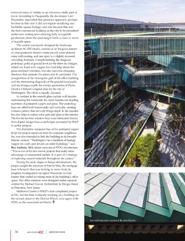
        surrounding the courtyard, the street façades are rippling
        tapestries of patinated copper and glass. The projecting
        bays are offset both horizontally and vertically, creating
        a macro-pattern that not only brings depth to the façades,
        but also helps to reduce solar gain and glare in the interior.
        The five-by-ten-foot window bays were fabricated directly
        from digital design files—a technique pioneered by SHoP
        in earlier projects.
                 The distinctive turquoise hue of the patinated copper
        helps the project stand out from its corporate neighbors,
        but was also intended to link the building to its broader
        historic context. “Washington has a tradition of [using]
        copper for roofs and details on older buildings,” said
        Ben Audrain, AIA, senior associate at WDG Architecture.
        “This is one of the few recent projects that really takes
        advantage of ornamental metals. It is part of a strategy
        of exploring natural materials throughout the project.”
                 During the early stages of design development, the  Penthouse level.
        project caught the attention of Fannie Mae, the mortgage
        loan behemoth that was looking to move from its
        longtime headquarters on upper Wisconsin Avenue.
        Fannie Mae ended up taking most of the building’s office
        space. The office interiors were designed under separate
        contract by Michael Graves Architecture & Design, based
        in Princeton, New Jersey.
                Midtown Center is SHoP’s first completed project
        in DC, but the firm is already working on a building for
        the second phase of the District Wharf, once again with
        WDG as the associated architects.


                                                             Saw-tooth bay pattern on one of the street façades.


           16                     MIDTOWN FUNK

