Page 17 - Fall 2019
P. 17
Each of the three earliest editions of the AIA Guide to the
                                                                       Architecture of Washington, DC, dating from 1965 to 1994,
                                                                       included a section titled “Midtown.” The term is rarely
                                                                       used today, but it once referred roughly to the area
                                                                       between K and P streets, NW, and between Connecticut
                                                                       and Vermont avenues. Before World War II, it was a
                                                                       transitional zone between the commercial downtown
                                                                       and the residential neighborhoods around Dupont and
                                                                       Logan Circles, but as commercial development pushed
                                                                       northward, the area lost its distinct identity.
                                                                                Midtown Center, a new building at the corner of 15th
                                                                       and L streets, NW, may help to resurrect that forgotten
                                                                       geographical designation, not merely by virtue of the
                                                                       building’s name, but also thanks to its thoughtful design.
                                                                       The project incorporates two substantial, publicly
                                                                       accessible outdoor spaces, along with a series of street-
                                                                       level pathways that crisscross the site, inviting pedestrians
                                                                       to cut through (and perhaps stop for refreshment at one
                                                                       of several food service establishments expected to open
                                                                       soon in ground-floor retail spaces). In conjunction with the
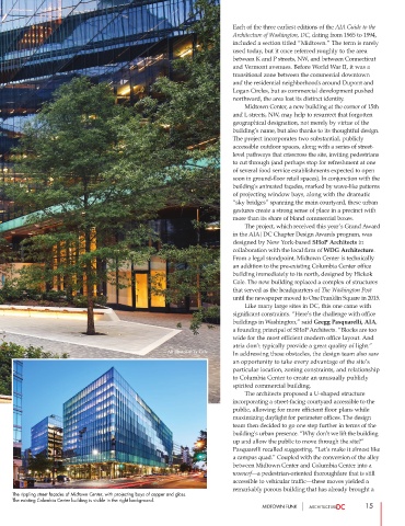
                                                                       building’s animated façades, marked by wave-like patterns
                                                                       of projecting window bays, along with the dramatic
                                                                       “sky bridges” spanning the main courtyard, these urban
                                                                       gestures create a strong sense of place in a precinct with
                                                                       more than its share of bland commercial boxes.
                                                                                The project, which received this year’s Grand Award
                                                                       in the AIA|DC Chapter Design Awards program, was
                                                                       designed by New York-based SHoP Architects in
                                                                       collaboration with the local firm of WDG Architecture.
                                                                       From a legal standpoint, Midtown Center is technically
                                                                       an addition to the pre-existing Columbia Center office
                                                                       building immediately to its north, designed by Hickok
                                                                       Cole. The new building replaced a complex of structures
                                                                       that served as the headquarters of The Washington Post
                                                                       until the newspaper moved to One Franklin Square in 2015.
                                                                               Like many large sites in DC, this one came with
                                                                       significant constraints. “Here’s the challenge with office
                                                                       buildings in Washington,” said Gregg Pasquarelli, AIA,
                                                                       a founding principal of SHoP Architects. “Blocks are too
                                                                       wide for the most efficient modern office layout. And
                                                                       atria don’t typically provide a great quality of light.”
                                                    All photos © Ty Cole
                                                                       In addressing these obstacles, the design team also saw
                                                                       an opportunity to take every advantage of the site’s
                                                                       particular location, zoning constraints, and relationship
                                                                       to Columbia Center to create an unusually publicly
                                                                       spirited commercial building.
                                                                               The architects proposed a U-shaped structure
                                                                       incorporating a street-facing courtyard accessible to the
                                                                       public, allowing for more efficient floor plans while
                                                                       maximizing daylight for perimeter offices. The design
                                                                       team then decided to go one step further in terms of the
                                                                       building’s urban presence. “Why don’t we lift the building
                                                                       up and allow the public to move through the site?”
                                                                       Pasquarelli recalled suggesting. “Let’s make it almost like
                                                                       a campus quad.” Coupled with the conversion of the alley
                                                                       between Midtown Center and Columbia Center into a
                                                                       woonerf—a pedestrian-oriented thoroughfare that is still
                                                                       accessible to vehicular traffic—these moves yielded a
                                                                       remarkably porous building that has already brought a
     The rippling street façades of Midtown Center, with projecting bays of copper and glass.
     The existing Columbia Center building is visible in the right background.
                                                                                MIDTOWN FUNK                   15

