Page 19 - Winter_2020
P. 19
Central corridor in the
                                                                                existing building before renovation.
                                                                                      Courtesy of R. McGhee & Associates

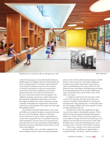
                       Early Education Learning Commons, with entry to the gymnasium at right.              Photo © Judy Davis


                       outdoor learning spaces, the modernization features a   pods as well as to the school’s common spaces on both
                       60,000-square-foot addition that more than doubles the   the first and second levels. The former auditorium
                       size the original school. The exterior stone and brick   becomes a new media center/maker space that is a
                       of the historic building are echoed in the variation   central and flexible focus for daily school activities.
                       of red brick and masonry of the new construction.   Where the new and historic buildings meet and where
                       At the base of the historic building, the transition   floor alignments transition is an open collaborative
                       between the stone and red brick is referenced in   space, termed the Nexus, which offers views of the
                       the new construction and ties the two together. The   entry and cupola.
                       addition’s massing, articulation, window placement,      A cafeteria is tucked into the lower level at the
                       and materials complement rather than overwhelm   corner of the building. This placement allows the
                       the original building. The school’s distinctive cupola   cafeteria to function independently for community
                       continues to dominate the original entry façade and   meetings and voting, and provide a rooftop play space
                       students can catch glimpses of it as they move through   for the youngest children. This below-grade level also
                       the building interior.                          provides parking for 25 cars.
                          Reoriented toward Davenport Street, a new entry      The interior is defined by ample natural light,
                       and lobby are located in the glassy connection between   views to the outdoors, and durable materials. Wood
                       the new and old buildings. Adjacent to the lobby   slatted ceilings and exposed brick provide organic
                       are two classroom wings or “pods” separated by an   elements in various locations. In places where it was
                       outdoor learning garden that is accessible to the pre-K   not possible to salvage the old terrazzo flooring, it was
                       and kindergarten common areas on the ground level.   replaced with new but similar terrazzo. In the 1930s
                       Open space between these pods allows natural light to   building, many “character-defining features” were
                       flood the classrooms and helps break down the overall   retained, such as millwork and Palladian windows.
                       scale of the addition.                              “There were a number of site issues that could
                          From the lobby, a new circulation spine joins the   be viewed as either challenges or opportunities,”
                       older building to the new classroom and gymnasium   recalled McGhee. “We always tried to see them as


                                                                             SCHOOLS ON A MISSION                 17

