Page 34 - ArchDC_Summer_2018
P. 34
ArchDC Summer 2018.qxp_Summer 2018  5/25/18  2:13 PM  Page 32


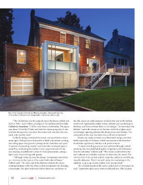
        Rear of the Fessenden Street house following renovation, showing the new bay
        of the kitchen at left center with storage below, and the new deck at right.

                “The old kitchen was the original one in the house, which was  the old, crank-out steel casement window that was at the kitchen
        built in 1940,” said Colbert, principal of the architectural firm Eric  north wall. I personally dislike corner cabinets and countertops in
        Colbert & Associates. “I didn’t even have a dishwasher. The space  kitchens, and have avoided them in this design.” As renovated, the
        was about 10 feet by 12 feet, and had four doors going into it, one  kitchen “opens the house out to the rear, with lots of glass and a
        from the dining room, one from the center hall, one from the rear  much-larger opening between the dining room and kitchen. The
        yard, and a pantry door.”                               connection to the new rear deck was a critical component.”
                Colbert’s design converted the dated, cramped kitchen into a          Details can make or break an architectural design, and that
        more open, T-shaped area that works as both a functional cooking  holds especially for kitchens, which incorporate a lot of surface
        and eating space and graceful passage to the back deck and yard.  treatments, appliances, fixtures, and power sources.
        A narrow, freestanding counter runs down the renovated space’s          “A clean overall appearance was achieved through careful
        centerline, reinforcing the kitchen’s new organizational scheme  planning that included building the refrigerator and dishwasher
        and creating an additional surface for food preparation, eating a  into the cabinetry,” Colbert said. “The electric outlets below the
        light meal, or socializing with guests.                 wall cabinets are carefully centered on horizontal tile joints. The
                “Although contemporary, the design incorporates symmetry  similar color of the outlets and tile helps the outlets to avoid being
        as a reference to the layout of the center-hall colonial house,”  visually obtrusive. There’s no wall above the countertop in the
        Colbert said. “The dark part of the kitchen contains the messy  addition, so pop-up electric outlets were incorporated.”
        cooking functions while the white section incorporates the cleaning          The circulation path in the newly added part of the project, he
        components. The glass-and-steel cabinet doors are a reference to  said, “represents open space between old and new. This all-glass


           32                     COOKING (WITH) LIGHT

