Page 47 - Spring_2018
P. 47
ArchDC Spring 2018.qxp_Fall 2017  2/22/18  9:12 AM  Page 45


     Photo © Joseph Romeo
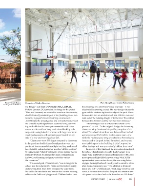
    Courtesy Perkins Eastman  Gymnasium of Watkins Elementary.                         Photo © Joseph Romeo Courtesy Perkins Eastman
                       the design,” said Sean O’Donnell, FAIA, LEED AP,  the driveway on a crosswalk with a stop sign—it was
                       Perkins Eastman DC’s principal-in-charge for the project.  effectively like crossing a street. The new design situates the
                       “First and foremost, we wanted to transform the obsolete,  gym and the cafeteria right on the edge of the park. Views
                       double-loaded, [academic part of the] building into a sus-  between the two are unobstructed, and children can now
                       tainable, high-performance learning environment.”  walk out of the building straight onto the field. The conflict
                       Accordingly, the project gutted and completely renovated  between the children and the cars has been removed.”
                       the school’s 60,380-square-foot academic wing, convert-          “The third goal was to enhance the school’s civic
                       ing its double-loaded arrangement—with small class-  presence,” he said. “In the original design, the four-story
                       rooms on either side of long, institutional-looking hall-  classroom wing dominated the public perception of the
                       way—into a single-loaded scheme, with larger and more  school. The school’s front door was dark and hard to find,
                       modern classrooms and support spaces located on one  as it was recessed behind the multipurpose room. And
                       side of a new and more spacious hall.           while the multipurpose wing was closest to Pennsylvania
                                “Classrooms—now 35% larger compared to classrooms  Avenue and to the park behind the school, and was the
                       in the previous double-loaded configuration—are pro-  most public space in the building, it didn’t respond to
                       portioned to accommodate multiple teaching modes and  either frontage and was perceptually hidden from view.”
                       have brightly colored entrance ‘porches’ off the corridor,”           In support of this third goal, the renovation demolished
                       O’Donnell said. “Shared ‘commons’ spaces feature playful  the school’s functionally obsolete, 10,253-square-foot,
                       furniture that can be arranged in many configurations   single-story multipurpose space and replaced it with a new,
                       for breakout learning and group activities outside   more open and light-filled support wing. With 26,338
                       the classroom.”                                 square feet of space on two levels, the new wing better
                                The second goal, O’Donnell said, “was to integrate the  engages the neighborhood visually, and is zoned to allow
                       school into the adjacent DC Parks and Recreation facility  after-hours community use. “The addition is dramatic
                       and playing field. They both occupied the same block,  inside and out,” O’Donnell said. “With large windows and
                       but vehicular circulation and service had cut the building  views, it connects the school to the park and creates a new
                       off from the fields and playground. Children had to cross  civic presence for the school at the front door on 12th Street.”

                                                                               REFRESHER COURSE                45

