Page 70 - ArchDC Fall 2018
P. 70
ArchDC Fall 2018.qxp_Fall 2018  8/27/18  8:35 AM  Page 68


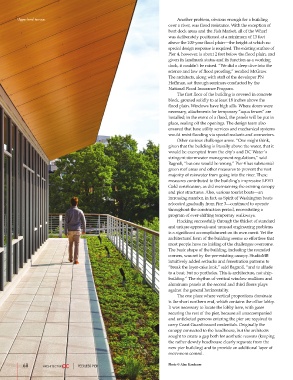
        Upper-level terrace.                                                   Another problem, obvious enough for a building
                                                                       over a river, was flood resistance. With the exception of
                                                                       boat dock areas and the Fish Market, all of the Wharf
                                                                       was deliberately positioned at a minimum of 13 feet
                                                                       above the 100-year flood plain—the height at which no
                                                                       special design response is required. The existing surface of
                                                                       Pier 4, however, is about 2 feet below the flood plain, and
                                                                       given its landmark status and its function as a working
                                                                       dock, it couldn’t be raised. “We did a deep dive into the
                                                                       science and law of flood proofing,” recalled McGraw.
                                                                       The architects, along with staff of the developer PN
                                                                       Hoffman, sat through seminars conducted by the
                                                                       National Flood Insurance Program.
                                                                               The first floor of the building is covered in concrete
                                                                       block, grouted solidly to at least 18 inches above the
                                                                       flood plain. Windows have high sills. Where doors were
                                                                       necessary, attachments for temporary “aqua fences” are
                                                                       installed; in the event of a flood, the panels will be put in
                                                                       place, sealing off the openings. The design team also
                                                                       ensured that base utility services and mechanical systems
                                                                       would resist flooding via special sealants and connectors.
                                                                               Other curious challenges arose. “One might think,
                                                                       given that the building is literally above the water, that it
                                                                       would be exempted from the city’s and DC Water’s
                                                                       stringent stormwater management regulations,” said
                                                                       Bagnoli, “but one would be wrong.” Pier 4 has substantial
                                                                       green roof areas and other measures to prevent the vast
                                                                       majority of rainwater from going into the river. These
                                                                       measures contributed to the building’s impressive LEED
                                                                       Gold certification, as did maintaining the existing canopy
                                                                       and pier structures. Also, various tourist boats—an
                                                                       increasing number, in fact, as Spirit of Washington boats
                                                                       relocated gradually from Pier 3—continued to operate
                                                                       throughout the construction period, necessitating a
                                                                       program of ever-shifting temporary walkways.
                                                                               Hacking successfully through the thicket of standard
                                                                       and unique approvals and unusual engineering problems
                                                                       is a significant accomplishment on its own merit. Yet the
                                                                       architectural form of the building seems so effortless that
                                                                       most people have no inkling of the challenges overcome.
                                                                       The basic shape of the building, including the rounded
                                                                       corners, was set by the pre-existing canopy. StudioMB
                                                                       intuitively added setbacks and fenestration patterns to
                                                                       “break the layer-cake look,” said Bagnoli, “and to allude
                                                                       to a boat, but no portholes. This is architecture, not ship-
                                                                       building.” The rhythm of vertical window mullions and
                                                                       aluminum panels at the second and third floors plays
                                                                       against the general horizontality.
                                                                               The one place where vertical proportions dominate
                                                                       is the short northern end, which contains the office lobby.
                                                                       It was necessary to locate the lobby here, with gates
                                                                       securing the rest of the pier, because all unaccompanied
                                                                       and unticketed persons entering the pier are required to
                                                                       carry Coast Guard-issued credentials. Originally the
                                                                       canopy connected to the headhouse, but the architects
                                                                       sought to create a gap both for aesthetic reasons (keeping
                                                                       the rather dowdy headhouse clearly separate from the
                                                                       new pier building) and to provide an additional layer of
                                                                       movement control.

           68                     PEERLESS PIER                        Photo © Alan Karchmer

