Page 35 - ArchDC Fall 2018
P. 35
ArchDC Fall 2018.qxp_Fall 2018  8/27/18  8:52 AM  Page 33


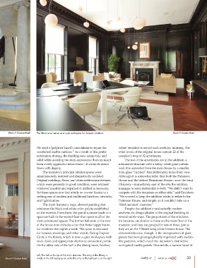
      Photo © Gordon Beall  The library now serves as a quiet workspace for Ampeer residents.          Photo © Gordon Beall


                       We used a [polymer-based] consolidator to repair the  where breakfast is served each weekday morning. The
                       weathered marble surfaces.” As a result of this gentle  other levels of the original house contain 22 of the
                       restoration strategy, the building now seems tidy and  complex’s total of 92 apartments.
                       solid while avoiding the stark appearance that can result          The rest of the apartments are in the addition, a
                       from overly aggressive renovations—it wears its minor  minimalist structure with a milky-white glass curtain
                       flaws with dignity.                             wall. It is separated from the main house by a smaller,
                               The mansion’s principal interior spaces were   dark-glass “hyphen” that deliberately fades from view.
                       simultaneously restored and dramatically updated.  Although it is somewhat taller than both the Patterson
                       Original moldings, floors, and other architectural features,  House and the historic Boardman House—now the Iraqi
                       which were generally in good condition, were retained  Chancery—immediately east of the site, the addition
                       wherever possible and repaired or infilled as necessary.  manages to seem deferential to both. “We didn’t want to
                       Yet these spaces now feel utterly au courant thanks to a  compete with the mansions on either side,” said Davidson.
                       striking mix of modern and traditional furniture, artworks,  “We wanted to keep the addition white, to relate to the
                       and light fixtures.                             Patterson House, and simple, so it wouldn’t take on a
                               The foyer features a large, abstract painting that   ‘third mansion’ character.”
                       reinforces the black-and-white color palette established          Despite the addition’s unabashedly modern
                       on the exterior. From there, the grand staircase leads to a  aesthetic, its design alludes to the original building in
                       spacious hall on the second floor that opens to all of the  several subtle ways. The proportions of the windows,
                       main communal spaces. The former ballroom at the rear  for instance, are similar to those on the main floor of the
                       of the house now includes a bar that hosts happy hours  mansion, and they are grouped in sets of three, just as
                       for residents five nights a week. The space is also used  they are on the P Street wing of the historic house. The
                       for lectures, meetings, and other events. Facing Dupont  cleverest reference, though, is the incorporation of glass
                       Circle is the library, which is now a quiet workspace with  panels that were photographically imprinted with marble-
                       sleek desks and appropriate electronic connection points.  like patterns, which recall the mansion’s distinctive
                       On the other side of the hall is the dining room/kitchen,  variegated marble panels. Meanwhile, a narrow band of


                       Left: The hall at the top of the main staircase. The entry to the library is
    Photo © Gordon Beall  visible in the left background, while the entry to the ballroom is to the right.  AMPED UP  33

