Page 55 - ArchDC_Winter2017
P. 55
ArchDC Winter 2017.qxp_Fall 2017  11/17/17  5:54 PM  Page 53


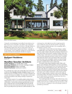
        Exterior of the Rockport Residence.                                                     Photo © Rob Karosis Photography

        Among the residential projects honored by the juries this year are  central pavilion, which offers its own line of sight toward the
        three houses in the countryside—two of them new-construction  water, encloses the entry, the stair hall, and the living/dining
        projects, the other a renovation and addition. Although different in  room. A separate structure provides a two-car garage with a
        their detailing, together they provide a short course in how the  second-floor “getaway” room.
        archetypal domestic form of a gable-roofed house—a triangle on          On the house’s exterior, driftwood-toned shingles combine
        top of a square—can be adapted in varying ways to create modern  with darker trim, a gray metal roof, and a gray stone foundation
        exurban residences for households with diverse programs.  to create a muted, neutral-color palette in keeping with the house’s
                                                                shore-side setting and the region’s maritime heritage. (If the term
        Merit Award in Architecture                             “shades of gray” didn’t have its own peculiar meaning nowadays,
                                                                it would neatly summarize the house’s exterior hues.) A partially
        Rockport Residence                                      inset porch and windows that wrap around some of the corners
        Rockport, ME                                            erode the house’s basic rectangular volumes, moving the design
                                                                away from a simple regional saltbox shape and toward a subtle
        Hamilton Snowber Architects                             geometric complexity that rewards careful study.
        Interior Designers: Jodi Macklin Interior Design                The interior color scheme is similarly muted: White walls
        Landscape Architects: Mohr & Seredin Landscape Architects  bounce around daylight while suggesting a relaxed, summertime
        Structural Engineers: Shemro Engineering                lifestyle. Blond wood flooring provides a soft contrast that anchors
        General Contractor: Cold Mountain Builders              the interior design without feeling too heavy. The living room’s
                                                                fireplace wall, surfaced in rusticated and smooth gray stone, provides
        For a peninsular site on the coast of Maine that slopes easily down  the main contrasting point of focus while tying the interior design
        to Penobscot Bay, Hamilton Snowber Architects designed a new,  to the hues on the outside. The kitchen’s island counter and the
        4,200-square-foot, five-bedroom house as a summer destination for  stair hall’s railings, finished in darker wood, provide additional
        a couple with four grown children. The design draws on the area’s  punctuation marks to the interior color scheme. Trim and detailing
        architectural traditions while taking advantage of spectacular  on the inside combine a traditional, country-house look with a
        water views.                                            more modern, spare design aesthetic.
                The house consists of two parallel, gabled pavilions that are           The overall impression of the design, both inside and out, is one
        staggered front to back so as to open up views from both of them,  of restraint and balance. The house’s modernity and sophistication,
        connected by a third pavilion running perpendicularly between  initially veiled by its use of traditional forms and materials, sneaks
        them. On the first floor, one of the parallel pavilions houses the  up on the observer, emerging over time as the design’s details are
        kitchen while the other encloses the master suite. On the second  cumulatively discovered.
        level, the parallel pavilions provide four additional bedrooms. The


                                                                                   BEST IN FIELD               53

