Page 78 - Summer_2019
P. 78
ArchDC Summer 2019.qxp_Spring 2019  5/22/19  3:02 PM  Page 76


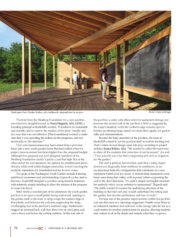
        Washington Youth Garden Pavilion, with chalkboards integrated into the structure.            Photo © Mark Luthringer


                 The brief from the Weisberg Foundation for a new pavilion  the pavilion, a cedar cube offers room for equipment storage and
        was relatively straightforward, as David Bagnoli, AIA, LEED, a  becomes the second wall of the pavilion; a third is suggested by
        founding principal at StudioMB, recalled: “It needed to be sustainable  the ramp’s handrail, while the northern edge remains open to
        and durable, and to express the mission of the place visually and  become an informal stage, raised two steps above grade, for garden
        in a way that was cost effective. [The Foundation] wanted to make  talks and demonstrations.
        sure that it was spending the dollars on the programs, and not          Beyond the basic amenities of the pavilion, the team at
        necessarily on the structure.”                          StudioMB wanted to use the pavilion itself as another teaching tool.
                 That cost-consciousness may have arisen from a previous  That’s where its roof design came into play, according to project
        foray into a new youth garden home that had stalled when the  architect Jenna Bolino, AIA. “We wanted to collect the rainwater,
        project came in around ten times higher than the proposed budget.  to show all the students that come how it can be reused,” she said.
        Although that proposal was well designed, members of the  “They actually use it for their composting pile and as irrigation
        Weisberg Foundation couldn’t justify a cost that high. But at the  for the garden.”
        other end of the cost spectrum, the options for prefabricated picnic          The roof is pitched, but inverted, such that a valley slopes
        shelters, while well within budget constraints, weren’t meeting the  downward diagonally from northeast to southwest, in an
        aesthetic aspirations the foundation had for its new venue.   asymmetrical butterfly configuration that culminates in a rain
                 The goals of the Washington Youth Garden include fostering  catchment barrel at its low point. A 14-inch-deep laminated-wood
        nutritional awareness and understanding of growth cycles, and to  beam runs along that valley, with exposed rafters supporting the
        that end, StudioMB designed a pavilion using humble materials  roof in the short directions. “It's quite a simple and legible structure
        with relatively simple detailing to allow the mission of the program  for anybody who's not an architect to understand,” Bagnoli said.
        to come into focus.                                     “We really wanted to express the underlying structure of the
                 Sited beside a wooded part of the arboretum, the youth garden  building so that kids not only would understand the setting and
        pavilion is set upon a small plinth facing northward, opening to  the garden, but also the architecture and how it's built.”
        the garden itself to the west. A ramp wraps the western edge of          Perhaps one of the greatest improvements within the pavilion
        that plinth, and between the columns supporting the large,   was one that came as a later-stage suggestion: Potable water flows to
        overhanging roof at the pavilion’s southern edge, chalkboards  an industrial, stainless steel sink next to the storage cube for use as a
        suggest an informal back wall that allows for air circulation and  wash station for produce picked from the garden, allowing students
        views above and below the writing surfaces. At the east side of   and visitors to sit in the shade and sample what they’ve grown.


           76                     RESPONDING TO A GROWING NEED

