Page 72 - Summer_2019
P. 72
ArchDC Summer 2019.qxp_Spring 2019  5/22/19  3:02 PM  Page 70


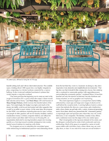
        The central space, with benches facing into the TV lounge.


        humble setting: dark and with no direct street presence. The available  from the fact that they were in a basement. In doing so, they drew
        space, totaling about 7,000 square feet, was highly irregular in  inspiration from domestic and neighborhood environments. “Our
        plan, comprising two distinct sections connected by a narrow   big idea was that it should be like coming into a house, then entering
        hallway. It also contained outdated mechanical systems that  into a courtyard or community garden, with supporting spaces
        would require a complete overhaul.                      surrounding the community garden,” explained Moya, whose firm
                 “Our main goal from the beginning was to create an oasis in the  handled not only the interior architecture, but also furniture and
        jungle of downtown DC—a place where the center’s clients would  fixture selection, as well as graphics and wayfinding.
        feel welcome and at home,” said Paola Moya, CEO and founder of          The client experience begins in a compact but cheerful lobby,
        Moya Design Partners, which oversaw the transformation of the  enlivened by a neon sign and large-scale images of plants on the
        space. Not surprisingly, the budget was tight, and much of the  wall behind the reception desk. A curving hallway leads to a dense
        money inevitably went toward mechanical and other upgrades that  corner that includes the showers, exam rooms, and a barbershop
        would be invisible to most visitors. At the same time, the program  niche where clients can get help with a variety of personal grooming
        for the DDSC was ambitious, including showers for men, women,  needs. From there, clients may proceed into the “community garden,”
        and people of other genders; self-service laundry facilities; medical  a surprisingly open and spacious area where they may eat, watch
        examination rooms; a kitchen; computer stations; and offices for  television, or use computers. The kitchen, laundry room, offices,
        social workers and other staff. Pathways to Housing DC, an  and a conference room line the edges of the airy central space.
        organization dedicated to moving homeless people into housing          That virtual garden is the signature element of the center, and
        quickly as a first step toward complete reintegration into society,  the designers worked hard to make it feel comfortable and even
        needed several stations for meetings with clients.      exhilarating. Much of the space is occupied by a series of small,
                 The designers set out to rationalize the convoluted space  square tables with vivid blue chairs, where clients may eat, read,
        while minimizing its institutional qualities—and distracting clients  play chess, or chat. At one end of the room are several benches—


           70                     DESIGNING FOR DIGNITY

