Page 64 - Summer_2019
P. 64
ArchDC Summer 2019.qxp_Spring 2019  5/22/19  3:02 PM  Page 62


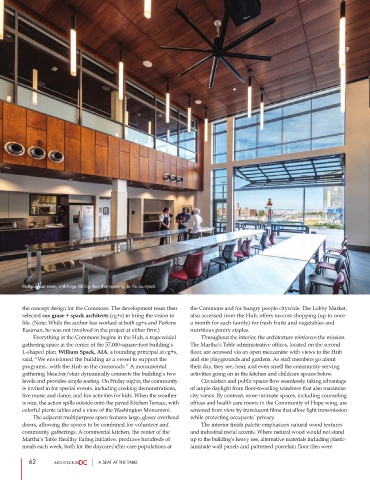
        Multipurpose room, with large folding door that opens up to the courtyard.


        the concept design for the Commons. The development team then  the Commons and for hungry people citywide. The Lobby Market,
        selected cox graae + spack architects (cg+s) to bring the vision to  also accessed from the Hub, offers no-cost shopping (up to once
        life. (Note: While the author has worked at both cg+s and Perkins  a month for each family) for fresh fruits and vegetables and
        Eastman, he was not involved in the project at either firm.)  nutritious pantry staples.
                 Everything at the Commons begins in the Hub, a trapezoidal          Throughout the interior, the architecture reinforces the mission.
        gathering space at the center of the 57,000-square-foot building’s   The Martha’s Table administrative offices, located on the second
        L-shaped plan. William Spack, AIA, a founding principal at cg+s,  floor, are accessed via an open mezzanine with views to the Hub
        said, “We envisioned the building as a vessel to support the   and site playgrounds and gardens. As staff members go about
        programs...with the Hub as the crossroads.” A monumental  their day, they see, hear, and even smell the community-serving
        gathering bleacher/stair dynamically connects the building’s two  activities going on in the kitchen and childcare spaces below.
        levels and provides ample seating. On Friday nights, the community           Circulation and public spaces flow seamlessly, taking advantage
        is invited in for special events, including cooking demonstrations,  of ample daylight from floor-to-ceiling windows that also maximize
        live music and dance, and fun activities for kids. When the weather  city views. By contrast, more intimate spaces, including counseling
        is nice, the action spills outside onto the paved Kitchen Terrace, with  offices and health care rooms in the Community of Hope wing, are
        colorful picnic tables and a view of the Washington Monument.  screened from view by translucent films that allow light transmission
                 The adjacent multipurpose space features large, glassy overhead  while protecting occupants’ privacy.
        doors, allowing the spaces to be combined for volunteer and          The interior finish palette emphasizes natural wood textures
        community gatherings. A commercial kitchen, the center of the  and industrial metal accents. Where natural wood would not stand
        Martha’s Table Healthy Eating initiative, produces hundreds of  up to the building’s heavy use, alternative materials including plastic-
        meals each week, both for the daycare/after-care populations at  laminate wall panels and patterned porcelain floor tiles were

           62                     A SEAT AT THE TABLE

