Page 49 - Summer_2019
P. 49
ArchDC Summer 2019.qxp_Spring 2019  5/22/19  2:58 PM  Page 47


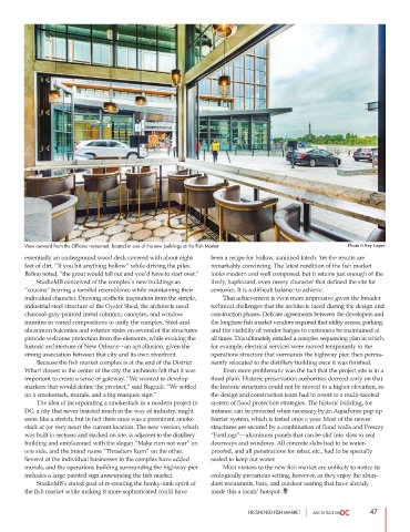
        View outward from the Officina restaurant, located in one of the new buildings at the Fish Market.  Photo © Rey Lopez

        essentially an underground wood deck covered with about eight  been a recipe for hollow, sanitized kitsch. Yet the results are
        feet of dirt. “If you hit anything hollow” while driving the piles,  remarkably convincing. The latest rendition of the fish market
        Bolino noted, “the grout would fall out and you’d have to start over.”  looks modern and well composed, but it retains just enough of the
                 StudioMB conceived of the complex’s new buildings as  lively, haphazard, even messy character that defined the site for
        “cousins” bearing a familial resemblance while maintaining their  centuries. It is a difficult balance to achieve.
        individual character. Drawing aesthetic inspiration from the simple,          That achievement is even more impressive given the broader
        industrial steel structure of the Oyster Shed, the architects used  technical challenges that the architects faced during the design and
        charcoal-gray-painted metal columns, canopies, and window  construction phases. Delicate agreements between the developers and
        muntins in varied compositions to unify the complex. Steel-and-  the longtime fish market vendors required that utility access, parking,
        aluminum balconies and exterior stairs on several of the structures  and the visibility of vendor barges to customers be maintained at
        provide welcome protection from the elements, while evoking the  all times. This ultimately entailed a complex sequencing plan in which,
        historic architecture of New Orleans—an apt allusion, given the  for example, electrical services were moved temporarily to the
        strong association between that city and its own riverfront.  operations structure that surrounds the highway pier, then perma-
                 Because the fish market complex is at the end of the District  nently relocated to the distillery building once it was finished.
        Wharf closest to the center of the city, the architects felt that it was          Even more problematic was the fact that the project site is in a
        important to create a sense of gateway. “We wanted to develop  flood plain. Historic preservation authorities decreed early on that
        markers that would define the precinct,” said Bagnoli. “We settled  the historic structures could not be moved to a higher elevation, so
        on a smokestack, murals, and a big marquee sign.”       the design and construction team had to resort to a multi-faceted
                 The idea of incorporating a smokestack in a modern project in  system of flood protection strategies. The historic building, for
        DC, a city that never boasted much in the way of industry, might  instance, can be protected when necessary by an AquaFence pop-up
        seem like a stretch, but in fact there once was a prominent smoke-  barrier system, which is tested once a year. Most of the newer
        stack at (or very near) the current location. The new version, which  structures are secured by a combination of flood walls and Presray
        was built in sections and stacked on site, is adjacent to the distillery  “FastLogs”—aluminum panels that can be slid into slots to seal
        building and emblazoned with the slogan “Make rum not war” on  doorways and windows. All concrete slabs had to be water-
        one side, and the brand name “Thrashers Rum” on the other.  proofed, and all penetrations for rebar, etc., had to be specially
        Several of the individual businesses in the complex have added  sealed to keep out water.
        murals, and the operations building surrounding the highway pier          Most visitors to the new fish market are unlikely to notice its
        includes a large painted sign announcing the fish market.  ecologically precarious setting, however, as they enjoy the abun-
                 StudioMB’s stated goal of re-creating the honky-tonk spirit of  dant restaurants, bars, and outdoor seating that have already
        the fish market while making it more sophisticated could have  made this a locals’ hotspot.


                                                                           FRESHENED FISH MARKET               47

