Page 59 - ArchDC Spring_2017
P. 59
ArchDC Spring 2017.qxp_Spring 2017  2/22/17  2:55 PM  Page 57


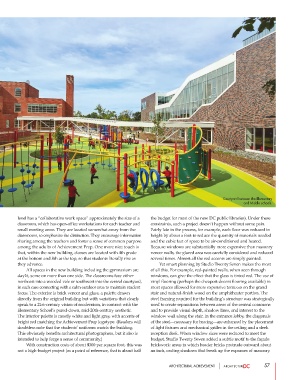
                                                                                              Courtyard between the Elementary
                                                                                                       and Middle schools.


        level has a “collaborative work space” approximately the size of a  the budget for most of the new DC public libraries). Under these
        classroom, which has open-office workstations for each teacher and  constraints, such a project doesn’t happen without some pain.
        small meeting areas. They are located somewhat away from the  Fairly late in the process, for example, each floor was reduced in
        classrooms, to emphasize the distinction. They encourage information  height by about a foot to reduce the quantity of materials needed
        sharing among the teachers and foster a sense of common purpose  and the cubic feet of space to be air-conditioned and heated.
        among the adults of Achievement Prep. One more nice touch is  Because windows are substantially more expensive than masonry
        that, within the new building, classes are located with 4th grade   veneer walls, the glazed area was carefully considered and reduced
        at the bottom and 8th at the top, so that students literally rise as  several times. Almost all the red accents are simply painted.
        they advance.                                                   Yet smart planning by Studio Twenty Seven makes the most
                 All spaces in the new building including the gymnasium are  of all this. For example, red-painted walls, when seen through
        daylit, some on more than one side. The classrooms face either  windows, can give the effect that the glass is tinted red. The use of
        northeast into a wooded vale or southwest into the central courtyard,  vinyl flooring (perhaps the cheapest decent flooring available) in
        in each case connecting with a calm outdoor area to maintain student  most spaces allowed for more expensive terrazzo on the grand
        focus. The exterior is brick veneer and glass, a palette drawn  stair and natural-finish wood on the amphitheater portion. The
        directly from the original building but with variations that clearly  steel framing required for the building’s structure was strategically
        speak to a 21st-century vision of modernism, in contrast with the  used to create separations between areas of the central commons
        Elementary School’s pared-down, mid-20th-century aesthetic.   and to provide visual depth, shadow lines, and interest to the
        The interior palette is mostly white and light gray, with accents of  window wall along the stair. In the entrance lobby, the diagonals
        bright red matching the Achievement Prep logotype. (Readers will  of the steel—necessary for bracing—are enhanced by the placement
        doubtless note that the students’ uniforms match the building.  of light fixtures and mechanical grilles in the ceiling and a sleek
        This obviously benefits architectural photographers, but it also is  reception desk. When window sizes were reduced to meet the
        intended to help forge a sense of community.)           budget, Studio Twenty Seven added a subtle motif to the façade
                 With construction costs of about $300 per square foot, this was  brickwork: areas in which header bricks protrude outward about
        not a high-budget project (as a point of reference, that is about half  an inch, casting shadows that break up the expanses of masonry.


                                                                        ARCHITECTURAL ACHIEVEMENT              57

