
Page 69 - ArchitectureDC_Spring2015
P. 69
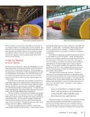
Information pod, with the waiting room visible in the background.                                    Information and retail pods.
                                                        Photo © Anice Hoachlander/Hoachlander Davis
                                                                                                                                   Photo © Anice Hoachlander/Hoachlander Davis

The two projects reviewed in this article both use an insertion of                                   elements, the solution had to provide a welcoming, comfortable, and
new design to improve an existing facility used by the public. But                                   enclosed—yet fully visible—environment within an aging structure
whereas in one case the goal was to develop a design that would                                      that was neither warm nor inviting.” The parking structure
draw attention away from the dreary, cavernous space in which                                        “was built for machines, not people; it would need an injection
the project is located, in the other it was to design a facility that                                of humanity.”
would do the opposite by showcasing the ornate beauty of the
historic hall that houses it.                                                                              Searching for an organizing concept for the project, the firm hit
                                                                                                     on the metaphor of a Zen rock garden. “Travel, and particularly
A New Bus Terminal                                                                                   bus travel, is a meditative experience, projecting the mind beyond
at Union Station                                                                                     the current place,” Ray said. At the same time, “this type of
                                                                                                     travel inherently comes with the tremendous visual accosting of
Intercity bus travel has made a comeback in Washington in recent                                     advertisements. We were seeking to create a place of mental
years, with several companies now offering economical service to                                     refuge.” The rock garden metaphor also responds to “the pure
and from New York and other destinations. To help capitalize on                                      physicality of the site—a grey parking deck striated by travel
that development, Union Station in 2012 was designated as the city’s                                 lanes and dividing strips, in which we wished to strategically
new central hub for intercity buses. The new hub was placed in                                       place small, iconic pavilions.”
the massive parking structure connected to the rear of the train
station, two levels up from the room where rail passengers wait                                            The project consists of three such pavilions. The first—a
to board trains.                                                                                     linked pair of ovoid structures that houses an information stand
                                                                                                     and a small retail store selling food, drinks, souvenirs, and traveler
      Bus terminals are often held up as examples of uninspired or                                   supplies—represents the rocks in the garden. In keeping with the
depressing design, and the initial bus hub at Union Station was a                                    meditative theme, the flat, yellow-painted sides of the pavilion are
case in point. Situated in a corner of the hulking, utilitarian parking                              textured with raised Morse Code dots and dashes that spell out
structure, the hub was squeezed into an awkwardly configured                                         lyrics from “Soul Meets Body,” a song by the musical group
spot dominated by escalators and bare concrete. To make the most                                     Death Cab for Cutie:
of this challenging site, Union Station Redevelopment Corporation
(USRC) selected Studio Twenty Seven Architecture.                                                            ‘Cause in my head there’s a Greyhound station

      “The bus terminal is removed from the facilities and amenities                                         Where I send my thoughts to far off destinations
of the majestic Beaux Arts masterpiece next door,” said Todd Ray
FAIA, the principal in charge of design for the project, referring to                                        So they may have a chance of finding a place
Union Station itself. “We were asked to design a solution that
would provide amenities to the bus traveler without requiring                                                Where they’re far more suited than here.
them to leave the bus deck.” The goal, the firm says, was to create
a sense of place in a situation of placelessness.                                                          The second pavilion is an enclosed, climate-controlled waiting
                                                                                                     room with nicely detailed wood-slat walls, an outdoor terrace
      “The site was neither interior nor exterior,” said Beverley                                    extension with bamboo plants, and floor-to-ceiling windows on
Swaim-Staley, president and CEO of USRC. “Open to the air and the                                    three sides that provide views to the terrace extension and other
                                                                                                     parts of the facility. The peaceful, 1,425-square-foot waiting room,

                                                                                                     WAIT AND SEE                  67