Page 83 - Fall 2019
P. 83
Family room, with dining room
                                                                  visible beyond transparent divider.

                                                                                                Photo © Paul Warchol Photography


                                        Photo © Paul Warchol Photography  Main living area.     Photo © Paul Warchol Photography


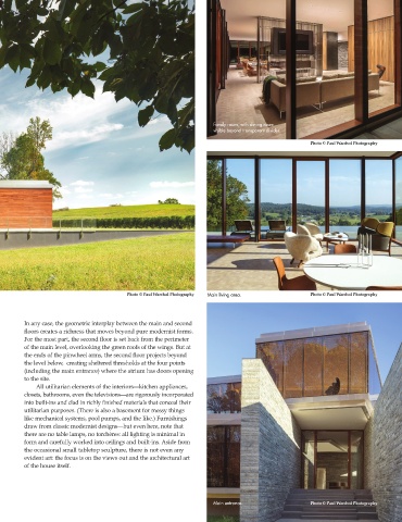
        In any case, the geometric interplay between the main and second
        floors creates a richness that moves beyond pure modernist forms.
        For the most part, the second floor is set back from the perimeter
        of the main level, overlooking the green roofs of the wings. But at
        the ends of the pinwheel arms, the second floor projects beyond
        the level below,  creating sheltered thresholds at the four points
        (including the main entrance) where the atrium has doors opening
        to the site.
                 All utilitarian elements of the interiors—kitchen appliances,
        closets, bathrooms, even the televisions—are rigorously incorporated
        into built-ins and clad in richly finished materials that conceal their
        utilitarian purposes. (There is also a basement for messy things
        like mechanical systems, pool pumps, and the like.) Furnishings
        draw from classic modernist designs—but even here, note that
        there are no table lamps, no torchères: all lighting is minimal in
        form and carefully worked into ceilings and built-ins. Aside from
        the occasional small tabletop sculpture, there is not even any
        evident art: the focus is on the views out and the architectural art
        of the house itself.


                                                                  Main entrance.                Photo © Paul Warchol Photography

