Page 68 - Fall 2019
P. 68
Washingtonian Residential Design Award

        Georgetown Row House
        Washington, DC
        Robert M. Gurney, FAIA,
        Architect

        Interior Designers: Baron Gurney Interiors
        Landscape Architects: Campion Hruby Landscape Architects
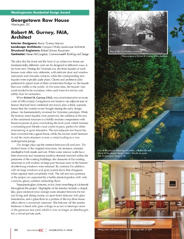
        Structural Engineers: Robert Silman Associates                    Rear of the house before renovation.
        Contractor: Steven McCaughan, Commonwealth Building and Design
                                                                                  Photo courtesy of Robert M. Gurney, FAIA, Architect
        The idea that the front and the back of an urban row house are
        fundamentally different, and can be designed in different ways, is
        far from new. During the Victorian era, the front façades of such
        houses were often very elaborate, with intricate door and window
        surrounds and dramatic cornices, while the corresponding rear
        façades were typically quite plain. Clients and architects alike
        preferred to spend more of their construction budget on the façade
        that was visible to the public. At the same time, the houses’ rear
        yards tended to be mundane, often used more for service and
        utility than for recreation.
                  When Robert M. Gurney, FAIA, was commissioned to renovate
        a trio of 19th-century Georgetown row houses—an adjacent pair of
        houses that had been combined previously plus a third, separate
        house that the current owner bought during the early design
        phase—he fundamentally reversed the Victorian paradigm. While
        the historic street façades were preserved, the addition at the rear
        of the combined structure is a boldly modern composition with
        broad expanses of glass overlooking the back yard, which features
        a swimming pool beside a taut carpet of grass, perfect for either
        entertaining or quiet relaxation. The non-adjacent row house has
        been converted into a guest house, while the narrow swath between
        it and the main structure is now a ramp leading to a new
        underground garage.
                 The design plays up the contrast between old and new. The
        distinct form of the original structures, for instance, remains
                                                                  Rear of the property following renovation, with the side wall
        intelligible both inside and out. While some interior walls have
                                                                  of one of the original houses visible in the slot at center,
        been removed, and numerous modern elements inserted within the  and the new guest house at left.
        perimeter of the existing buildings, the character of the existing
        structures is still evident, in large part because most of the historic
        double-hung windows were retained. By contrast, the addition,
        with its large windows and glass pocket doors that disappear
        when opened, feels completely fresh. The old and new portions
        of the project are separated by a lushly planted garden, with only
        a narrow, glassy corridor connecting them.
                  Transparent glass elements, in fact, form something of a leitmotif
        throughout the project. Highlights of the interior include a chapel-
        like, glass-enclosed wine storage room situated between the for-
        mal living and dining rooms, an open-tread staircase with glass
        balustrades, and a glass floor in a portion of the top-floor home
        office above a secondary staircase. The balcony off the master
        bedroom is lined with glass railings so as not to interrupt views
        of the generous rear yard, which is now no longer an afterthought,
        but a virtual private park.


           66                     WASHINGTON AT HOME              Dining room, with glass-enclosed wine storage room at right.

