Page 60 - Fall 2019
P. 60
Chapter Design Award in Architecture

        Signature at
        Reston Town Center
        Reston, VA
        Shalom Baranes Associates

        Interior Design Consultants: Hartman Design Group
        Landscape Architects: LSG Landscape Architects
        Structural Engineers: Thornton Tomasetti
        MEP Engineers: WSP
        General Contractor: HITT Contracting

        The Signature at Reston Town Center, also designed by
        Shalom Baranes Associates, is located at the corner of
        Reston and New Dominion parkways in northern Virginia.
        The site “is the last major piece of a decades-long master
        plan and build-out that completes the vision of [developer]
        Robert Simon for an interconnected network of urban
        villages in Reston,” the firm said. “While much of the
        architecture in the central town center has post-modern
        and neo-traditional trappings, the design team for the
        Signature site found inspiration in the nearby satellite
        village of Lake Anne, a 1960s-era community also
        envisioned by Simon that embodies a brutalist modern
        language.” The Signature project’s design “combines
        the best aspects of Reston’s ’60s modernism and ’90s
        New Urbanism.”
                The project, with about 1.28 million square feet of
        space and 508 living units, consists of two wings, each
        capped by a slender residential tower, with the west
        wing forming part of a mixed-use parcel facing the town
        center. A large-format grocery store anchors the site’s
        southwest corner. Near the street, the above-grade part
        of the building’s multi-level parking facility is screened
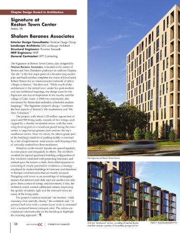
        by a line of eight narrow mini-towers, each housing a trio
        of vertically stacked two-floor residences.
                 Windows on the towers’ facades are spaced regularly
        in some places and irregularly in others. The architects
        avoided the typical apartment building configuration of
        bay windows combined with projecting balconies, and  The Signature at Reston Town Center.
        instead gave the towers a sleek, clean-sided appearance
        consisting of crisply punched-in windows—a strategy
        employed by modern buildings in Germany and elsewhere
        in Europe—and balconies that are mostly recessed.
        Designing each tower as an assemblage of rectangular
        masses that intersect and slide past one another not only
        gives them a sense of energy and movement, it also, the
        architects noted, created additional corners, improving
        the quality of interior light and the outward views for
        many of the living units.
                 The project’s exterior materials “are modest—brick
        masonry—but carefully chosen,” the architects said. “A
        primary buff color with a custom slurry wash is contrasted
        with a textured bronze ironspot color. The colors are
        employed volumetrically on the building to highlight
        the massing approach.”


           58                     STRENGTH IN NUMBERS        Mid-rise “townhouse” section, consisting of stacked duplex  Photo © Alan Karchmer/OTTO
                                                             units that obscure a portion of the parking garage behind.

