Page 77 - Fall_2017
P. 77
ArchDC Fall 2017.qxp_Fall 2017  8/10/17  1:17 PM  Page 75


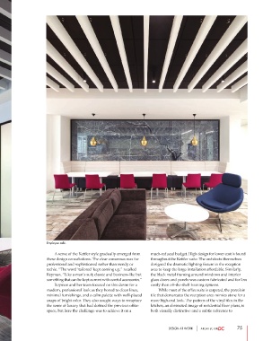
                       Employee café.

                               A sense of the Kettler style gradually emerged from  much-reduced budget. High design for lower cost is found
                       these design consultations. The clear consensus was for  throughout the Kettler suite. The architects themselves
                       professional and sophisticated rather than trendy or  designed the dramatic lighting fixture in the reception
                       techie. “The word ‘tailored’ kept coming up,” recalled  area to keep the large installation affordable. Similarly,
                       Reyman. “Like a man’s suit; classic and business-like but  the black metal framing around windows and interior
                       something that can be kept current with careful accessories.”  glass doors and panels was custom fabricated and far less
                               Reyman and her team focused on this desire for a  costly than off-the-shelf framing systems.
                       modern, professional look as they honed to clean lines,           While most of the office suite is carpeted, the porcelain
                       minimal furnishings, and a calm palette with well-placed  tile that demarcates the reception area mimics stone for a
                       snaps of bright color. They also sought ways to recapture  more high-end look. The pattern of the vinyl tiles in the
                       the sense of luxury that had defined the previous office  kitchen, an abstracted image of residential floor plans, is
                       space, but here the challenge was to achieve it on a   both visually distinctive and a subtle reference to


                                                                               DESIGN AT WORK                  75

