Page 62 - Fall_2017
P. 62
ArchDC Fall 2017.qxp_Fall 2017  8/10/17  1:16 PM  Page 60


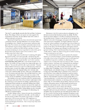
        Informal conference space overlooking the News Hub one floor below.  A staff collaboration space with notable Post headlines on the glass partition at right.


        “first draft” is quite literally created in the Hub and Story Conference          References to the Post’s past are almost as ubiquitous as the
        Room. The design of these core spaces not only supports the  television monitors that broadcast present-day affairs. The Ben
        organization’s functions, but also imbues them with a sense of  Bradlee quotation adjacent to the Story Conference Room is only
        energy, excitement, and gravity.                        the most prominent of dozens of quotations by Post luminaries. In
                Specialized though they are, these core newsroom spaces have  addition to the wall of front pages, some glass walls are decorated
        a secondary function: hosting celebrations. For example, when a  with word clouds of headlines. The larger conference rooms are
        Post employee wins a Pulitzer, an announcement ceremony takes  named for various publishers and top brass from the pre-Bezos era
        place here. The monitors are switched to party-decorations mode,  of the Post. The entrance from the elevator lobby to the most public
        and employees ring the balcony railings above to watch the event.  portion of the offices, the 4th floor special events space, features
        A new name is added to the Wall of Fame, and then, of course,  the Washington Post logotype sign salvaged from the former head-
        everyone—including the winner—gets back to work, which, given  quarters building. This is counterbalanced by what Gensler calls
        that the Hub is the physical center of the newsroom, never  “media totems,” which are columns wrapped in monitors showing
        involves more than a short walk.                        imagery customized to each event.
                So much energy comes from the basic functioning of the place          The mostly black-and-white palette speaks to the physical
        that part of Gensler’s task was to provide a countervailing calm.  character of a printed newspaper. Architecturally, the general feeling
        “There’s a sense of buzz, even when there’s not a big breaking story.  of the office space is clean and polished, as one would expect for
        You see people running around, literally,” said Gensler associate  an established corporation, but there are offsetting touches—
        Carol Schneider, IIDA, LEED AP, a lead interior designer on the  exposed areas of ceiling with ducts and conduit visible, exposed
        project. This fulfills CEO Ryan’s desire for a high-energy space, she  concrete columns—that speak to the industrial loft style associated
        allowed, “But you still need to be able to get work done.” Physical  with start-ups in general and technology companies in specific.
        sound control is provided by carpet in workstation areas and some          The company’s new office search started in 2013, with Gensler
        meeting rooms, acoustic tile ceilings, and sound-absorbing black  test-fitting some 35 buildings. The Post had settled upon One
        foam installed above the diagonal ceiling slats. Aesthetic calm  Franklin Square, and schematic design was well underway, prior
        comes from a neutral palette of black, white, grey, and light-toned  to Amazon founder Jeffrey Bezos’s purchase of the company in
        wood. The main accent is the blue—the particular shade of a video  mid-2014. Bezos’ team shifted the direction toward new media,
        screen background—which appears not only on so many of the  and cut the amount of leased space considerably without cutting
        screens, but also in upholstery of casual seating in breakout areas.   staff size. That meant the adoption of what Gensler refers to as
                 The intention was to give emphasis to the Post’s greatest assets:  “universal planning,” in which more than 90% of the staff gets a
        its employees and content. Part of the architects’ achievement is that  uniform bench-style workstation, six feet long with an L-shaped
        the visual focus is provided, but the setting is neither boring nor  return. Only 7% of the staff has private offices. There are, however,
        background. Floor materials are constantly shifting, from sealed  copious collaboration spaces, as well as small enclosed spaces,
        concrete to wood to carpet. In common-use spaces the carpets are  sometimes called phone rooms, where one can have a private
        mostly bound area rugs, but in all areas carpets have linear patterns  phone conversation or work in silence and solitude.
        that have constant subtle shifts. Ceiling designs are also constantly          “It had to work for 40-year print veterans, the Post’s in-house
        modulating in modest ways—not enough to be distracting, but  SnapChat staff, and everyone in between,” commented McKinnon.
        sufficient to maintain interest.                        Doubtless there are employees who miss their private offices, but
                Gensler’s design strikes a balance between the storied history  the Post overall is thriving, and the energized atmosphere sought
        of the Post—a source of inspiration and pride—and the reality of  by CEO Ryan is unmistakable. With assistance from Gensler and
        the fast-moving world of the modern mass media. At 242,000  Jeffrey Bezos, the Washington Post has come out of the darkness.
        square feet of office space and some 1,575 employees in a
        dozen divisions over six floors, “This isn’t a start-up company,”
        emphasized designer McKinnon. “But in many ways they must
        act as if they are.”

           60                     DEMOCRACY LIVES IN LIGHT

