Page 26 - ArchDC_Summer_2018
P. 26
ArchDC Summer 2018.qxp_Summer 2018  5/25/18  2:13 PM  Page 24


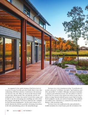
        View from the house toward the water.


                As suggested by the careful planning of the Hub (a back-of-          The house has a clean, transitional styling. “A combination of
        house service space that often gets short shrift), these owners take  modern and gnarly” is Williams’ descriptor; “part farmhouse, part
        weekending at the beach seriously. Connections to the landscape  shed, part modern” is Gardner’s. Although a modicum of messiness
        and fresh air were vital. Many new houses in the area are raised   is, arguably, part of the beach house vibe, the architects worked to
        an entire story off the ground. That conveniently puts the cars  tame it here. In contrast to the original mid-century house, there is
        underneath, but it’s higher than needed to resist storm surges, and  plenty of storage. Separate dedicated spaces are provided for bicycles,
        it tends to turn the surroundings into something one views rather  beach equipment, kayaks, and outdoor furnishings. This facilitates
        than engages with directly. This house is raised four feet—adequate  use of these items—important in a weekend house where time is
        for flood insurance requirements—but the yard is terraced up to  limited—while reducing clutter.
        mostly eliminate the need for guardrails, minimizing obstructions          The house faces west-southwest to the canal, potentially a
        to the view and facilitating access to the natural landscape.  terrible orientation for a beach house, given the movement of the


           24                     NOT ROUGHING IT

