Page 54 - ArchDC_Spring 2020
P. 54
struck by both the limitations and prospects of the site.   Construction required stripping the space bare.
                       “We saw the immediate potential of the space when we   Upgrading the electrical panel and water utilities in
                       didn’t enter the apartment through an interior corridor,   the 50-plus-year-old building involved temporarily
                       but through a courtyard,” said Boza. They were drawn   shutting down those services in a whole wing of the
                       to the street-front aspect and the fact that the front door   complex. Plus, there was asbestos everywhere, in
                       was seldom used.                                perimeter walls and in the insulation, which needed to
                          Inside, the extent of the work required to adapt   be remediated before demolition.
                       this unit became apparent. “The space was extremely   Another obstacle was the couple’s king-size bed,
                       dark and filled with old furniture,” recalled Boza.   which occupied an incredibly large portion of the space
                       “There were multiple code violations left over from the   in the previous layout. The architects decided that, like
                       original design, like a lack of ventilation for the stove   many other functions, this too could be embedded into
                       and an electrical panel above the sink, in addition to a   the wall. It would be stored in a customized vertical
                       low-clearance shower.”                          pull-down cabinet.
                          The clients, a married couple who purchased      The apartment was transformed from being
                       the studio apartment two years earlier, share the   essentially a dark, cluttered bedroom that happened
                       500-square-foot unit. It’s a tight space for two people,   to have a kitchen in it, into a bright, open living and
                       especially given that the husband stands 6’-8” tall, and   entertaining space that happened to have a bed in
                       often works from home, and the wife is a chef who   it—or not, when the bed is stashed away. The high-
                       wanted ample space for cooking. The design team   gloss lacquer surfaces are luminous, and serve to blur
                       benefited from the open-mindedness of their clients.   perceptions of the space’s perimeter. “The intention of
                       “They had a desire to be in the city,” the team noted.   high-gloss was to create a reflection that would subtly…
                       Rather than directing the architects on how they   expand the space and to make it feel that it goes on
                       wanted the space to look, they instead shared their   beyond the cabinets,” explained Boza.
                       vision for its use—working from home, cooking, and   By adding pops of color where activity would
                       hosting guests.                                 occur, the architects could both demarcate areas of
                          The team explored various configurations during   function and provide visual accents to create a sense
                       the design phase, eventually landing on a scheme   of depth, especially when seen from the outside. The
                       in which most built-in elements were pushed to   wood flooring that begins at the sliding door entryway
                       the perimeter walls, with cabinets enclosing much   turns up again on the back side of the kitchen island
                       equipment in order to maintain a calm, simple interior   in the heart of the space, and yellow tilework is used
                       aesthetic. “By embedding the different programs like   as a backboard for the sink, as well as for the bed and
                       cooking, bath, entertainment, sleeping, and storage,   television program areas. A beloved line of red mid-
                       the limited space is both maximized and highly   century kitchen cabinets was the only thing carried
                       customized for the users,” explained Geiss.     over from the old apartment. At the suggestion of the


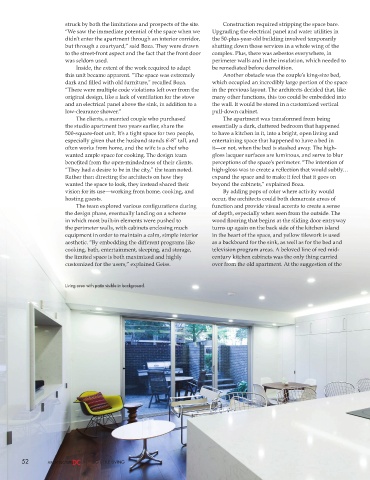
                       Living area with patio visible in background.


        52                     BIG LITTLE LIVING

