Page 66 - Spring_2018
P. 66
ArchDC Spring 2018.qxp_Fall 2017  2/22/18  9:14 AM  Page 64


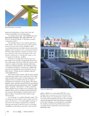
        Detail of the pavilion’s roof structure.


        projects including about a dozen curriculum and
        community gardens and several pavilions.
                “In a project this simple,” said ISTUDIO principal
        Rick Harlan Schneider, AIA, APA, LEED AP, “you
        look for ‘teaching moments’ in otherwise mundane
        architectural moves.”
                One teaching moment came with the placement
        of the kitchen. The previous two pilot projects put the
        kitchen under the cover of their pavilions, which
        necessitated elaborate and costly exhaust and sprinkler
        systems similar to what one sees in restaurant kitchens.
        ISTUDIO argued that there wouldn’t be classes in the
        rain anyway, so why not pull the kitchen out? A chic
        kitchen—worthy of an “amenity deck” atop a pricey
        new apartment building—resulted.
                Similarly, the storage shed in the previous two
        pilot projects was basically a background element in a
        less-visible corner. Here it sits under the pavilion, and
        consists of a basic wood frame structure with milky
        white polycarbonate cladding. The cladding is usable
        as a marker board (that is, a modern-day chalkboard)
        and, since it’s translucent, allows the shed to have no
        light fixtures. “Things can serve multiple purposes”
        is the implicit lesson.
                Most of the concrete planter walls from the original
        courtyard were retained; new concrete provides wheel-
        chair-accessible ramps and a two-tier seating area. The
        original brick was combined with new to create an
        inexpensive but distinctive paving pattern. The raised
        planters of the curriculum garden dominate the planted
        areas, including one large square known as the “pumpkin
        patch” where the “Three Sisters” of Native American
        tribes and the Puritan colonists (corn, pole beans, and
                                                         Pavilion and outdoor kitchen.
        squash) will be planted, bringing a history lesson into
        the courtyard. Responding to a stated interest of the
                                                         gables might be more interesting, ISTUDIO’s team
        parents, sleeves for potential future chicken coops
                                                         thought, and at some point it occurred to them that
        were installed.
                                                         the folded shape was something like a paper airplane.
                For the design of a pavilion, Schneider noted, “The
                                                         That realization inspired the decision to skew the grid,
        first thing you must consider is how to drain water off,
                                                         introducing diagonals that lend additional dynamism
        away from the users.” An inverted gable, draining to a
                                                         to the form. Drainage was emphasized by extending
        low point in the middle, would provide controlled
                                                         the channels several feet beyond the pavilion and
        drainage and would fit with the school’s architectural
                                                         providing chains to guide the water downward to
        vocabulary of mid-century modernism. Two inverted
                                                         bioretention pits.
           64                     TEACHING MOMENTS

