Page 33 - Spring_2018
P. 33
ArchDC Spring 2018.qxp_Fall 2017  2/22/18  9:12 AM  Page 31


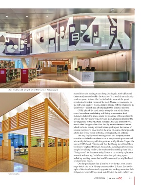
        Main circulation desk (at right), with children’s area in the background.
                                                                placed the main reading room along that façade, with tables and
                                                                chairs neatly nestled within the structure. The result is an eminently
                                                                modern space, but one that harks back to some of the great
                                                                neoclassical reading rooms of the past. Moreover, passersby on
                                                                the sidewalk can now clearly glimpse library patrons engrossed in
                                                                their books—a bit of free advertising for the library’s mission.
                                                                        CORE placed the book stacks along the rear of this linear
                                                                space, beneath an undulating wall lining a mezzanine level
                                                                (behind which is the fitness center for residents of the apartments
                                                                above). The curvilinear wall provides a sculptural counterpoint to
                                                                the angularity of the structural columns. It is also animated by a
                                                                mural titled Paragons of the West End, by artist Adrienne Gaither,
                                                                which includes heavily stylized letters spelling out the names of
                                                                famous people who have lived in the area. Of course, the large-scale
                                                                letters also evoke words in books, appropriately for a library.
                                                                        The airy, highly visible reading room and the jazzy mural
                                                                over the stacks both contribute to an atmosphere of openness and
                                                                informality in keeping with the goals set out by Ginnie Cooper, the
                                                                former DCPL head. “Ginnie said that the library should feel like a
                                                                bookstore,” explained Stewart. Instead of a stereotypically hermetic
                                                                temple for solitary readers, she envisioned something more like a
                                                                “living room” for the community. It was to be not only a place for
                                                                research and reading, but also an attractive gathering space,
                                                                including meeting rooms that could be accessed by neighborhood
                                                                residents after hours.
                                                                        One by-product of that directive is evident as soon as one
                                                                steps inside the main library entrance off of L Street. Just to the
                                                                right of the circulation desk, opposite the reading room, is a full-
                                                                fledged, commercially operated café. By day, the café—which was
        Children’s area.
                                                                                 LATEST EDITION                31

