Page 43 - ArchDC Fall 2018
P. 43
ArchDC Fall 2018.qxp_Fall 2018  8/27/18  8:34 AM  Page 41


                                                                                                       Photo © Jeffrey Sauers
                              “The Anacostia [River] had a big influence [on the          Although the apartment building presents itself
                       project’s design],” said Laurence Caudle, AIA, a principal  along First Street as a basic rectangular form, its floor plate
                       and director of housing at Hickok Cole. “There was a  is actually U-shaped, with the First Street façade forming
                       quality of light because of the Anacostia that you could  the bottom of the U and the building’s two side wings
                       see and almost feel. We also knew that our building would  extending away from First Street, toward the center of
                       be seen from afar before future Navy Yard phases [on the  the block. A U-shaped floor plate is a traditional scheme
                       other side of First Street] were built. So the biggest [design]  for Washington-area apartment buildings that increases
                       moves we made were what we refer to as the horizontal  natural light and ventilation for building residents. In
                       bays along the residential façade. The ins and outs and  this case, the arrangement created a tranquil courtyard
                       metal-and-glass nature of those bays created a reflective  between the two wings that is isolated from the traffic
                       quality that reminded us of the water.”         noise of the ballpark district.
                               The building’s response to the nearby waterway is          The street-level entry was made relatively narrow so
                       also evident in the non-glass exterior surfaces. “We used  as to help maximize leasable commercial space along
                       high-performance thin precast [concrete] panels from a  First Street, which is a primary corridor for people walking
                       company called TAKTL,” Caudle said. “The panels are a  between the ballpark and the nearby Navy Yard-Ballpark
                       denim blue color with a wave pattern that was inspired  Metro station. Consequently, the entry uses height rather
                       by our proximity to the river.”                 than width to generate a sense of grandeur. The two-story
                               The apartment structure “is a mid-block building  space features a prominent metal-and-glass stairway
                       flanked by hotels [the Residence Inn on one end and a  leading up to the building’s second-level leasing office,
                       second hotel on the other side] that have vertical   and is surfaced partly with seven-inch-tall horizontal
                       proportions, so we chose to create a very strong horizontal  planks of milk-washed reclaimed oak—a somewhat
                       expression” in the apartment building’s design, Caudle  rustic-looking material that complements the entry’s
                       continued. “To emphasize the horizontality, we put   more refined surfaces and can also be taken as a
                       continuous balconies every third floor rather than the  maritime or boardwalk reference.
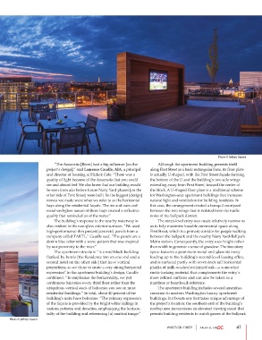
                       ubiquitous vertical stack of balconies you see on most          The apartment building includes several amenities
                       residential buildings.” In total, about 40 percent of the  common to modern Washington luxury apartment
                       building’s units have balconies. “The primary expression  buildings, but boasts one that takes unique advantage of
                       of the façade is provided by the bright white railings in  the project’s location: the southern end of the building’s
                       various patterns and densities, emphasizing the horizon-  rooftop area incorporates an elevated viewing stand that
                       tality of the building and referencing [a] nautical image.”  permits building residents to watch games at the ballpark
     Photo © Jeffrey Sauers
                                                                               WHO’S ON F1RST?                 41

